Navbar Using Bootstrap to Implement a Navbar
In this deets, I will explain the concept of a navbar and how to use the Bootstrap template to add a navbar to an app. A navbar typically sits at the top of a webpage and provides links to other major pages on the site. It can also include other functions such as a search bar.
Background: <nav> vs. Navbar
HTML provides a tag called <nav> that is meant to be used for a collection of links. This could be a table of contents, a table, or an index, for example. Bootstrap helped to standardize the concept of the navbar as a horizontal frame at the top of a webpage with links and other simple, relevant functions. This has since become one of the most popular ways of navigating a website.
The Parts of the Navbar Template
To show the different parts of a Bootstrap navbar, we will use Bootswatch’s Pulse theme’s navbar as an example, shown in figure 1.

Figure 1. Bootswatch’s Pulse navbar.
The code for the navbar in figure 1 is this:
<nav class="navbar navbar-expand-lg navbar-dark bg-primary">
  <a class="navbar-brand" href="#">Navbar</a>
  <button class="navbar-toggler" type="button" data-toggle="collapse" data-target="#navbarColor01" aria-controls="navbarColor01" aria-expanded="true" aria-label="Toggle navigation">
    <span class="navbar-toggler-icon"></span>
  </button>

  <div class="navbar-collapse collapse show" id="navbarColor01" style="">
    <ul class="navbar-nav mr-auto">
      <li class="nav-item active">
        <a class="nav-link" href="#">Home
          <span class="sr-only">(current)</span>
        </a>
      </li>
      <li class="nav-item">
        <a class="nav-link" href="#">Features</a>
      </li>
      <li class="nav-item">
        <a class="nav-link" href="#">Pricing</a>
      </li>
      <li class="nav-item">
        <a class="nav-link" href="#">About</a>
      </li>
      <li class="nav-item dropdown">
        <a class="nav-link dropdown-toggle" data-toggle="dropdown" href="#" role="button" aria-haspopup="true" aria-expanded="false">Dropdown</a>
        <div class="dropdown-menu">
          <a class="dropdown-item" href="#">Action</a>
          <a class="dropdown-item" href="#">Another action</a>
          <a class="dropdown-item" href="#">Something else here</a>
          <div class="dropdown-divider"></div>
          <a class="dropdown-item" href="#">Separated link</a>
        </div>
      </li>
    </ul>
    <form class="form-inline my-2 my-lg-0">
      <input class="form-control mr-sm-2" type="text" placeholder="Search">
      <button class="btn btn-secondary my-2 my-sm-0" type="submit">Search</button>
    </form>
  </div>
</nav>
Let’s break it down into smaller pieces.
Nav Element
The outer tag of the navbar is the <nav> tag that we talked about in the beginning of these deets.
<nav class="navbar navbar-expand-lg navbar-dark bg-primary">
...
</nav>
Title
The Title of the web app which appears in the left-hand corner of the navbar.
<a class="navbar-brand" href="#">Navbar</a>
Hamburger
When the browser is made small enough, a hamburger menu will appear which will expand when clicked.
This is what the navbar looks like when the browser is downsized, before being clicked:

Figure 2. Bootswatch’s Pulse navbar with unexpanded hamburger.
This is the expanded navbar after clicking the hamburger:
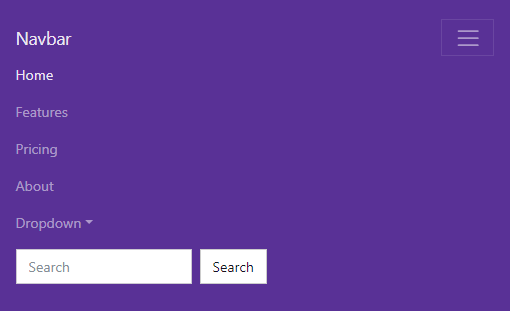
Figure 3. Bootswatch’s Pulse navbar with expanded hamburger.
The code that governs the hamburger functionality is:
<button class="navbar-toggler" type="button" data-toggle="collapse" data-target="#navbarColor01" aria-controls="navbarColor01" aria-expanded="true" aria-label="Toggle navigation">
  <span class="navbar-toggler-icon"></span>
</button>

<div class="navbar-collapse collapse show" id="navbarColor01" style="">
...
</div>
The two pieces of code here are the button, and the div containing all of the links. To make the collapse/expand functionality work, the button has data-toggle and data-target options. data-toggle indicates that clicking on the button should toggle between collapse and expand states. data-target, which points to the id (#) navbarColor01, indicates which div should be collapsed and expanded. Here that is the <div> tag with “navbarColor01” as its id which contains all the links in the bar.
Main Content
All the links in the navbar belong in the <div> container that has class="collapse navbar-collapse", as we discussed before.
<div class="navbar-collapse collapse show" id="navbarColor01" style="">
  <ul class="navbar-nav mr-auto">
    <li class="nav-item active">
      <a class="nav-link" href="#">Home
        <span class="sr-only">(current)</span>
      </a>
    </li>
    <li class="nav-item">
      <a class="nav-link" href="#">Features</a>
    </li>
    <li class="nav-item">
      <a class="nav-link" href="#">Pricing</a>
    </li>
    <li class="nav-item">
      <a class="nav-link" href="#">About</a>
    </li>
    <li class="nav-item dropdown">
      <a class="nav-link dropdown-toggle" data-toggle="dropdown" href="#" role="button" aria-haspopup="true" aria-expanded="false">Dropdown</a>
      <div class="dropdown-menu">
        <a class="dropdown-item" href="#">Action</a>
        <a class="dropdown-item" href="#">Another action</a>
        <a class="dropdown-item" href="#">Something else here</a>
        <div class="dropdown-divider"></div>
        <a class="dropdown-item" href="#">Separated link</a>
      </div>
    </li>
  </ul>
  <form class="form-inline my-2 my-lg-0">
    <input class="form-control mr-sm-2" type="text" placeholder="Search">
    <button class="btn btn-secondary my-2 my-sm-0" type="submit">Search</button>
  </form>
</div>
Links
Within the main content <div>, the first thing we see is an unordered list (<ul>), with the class “navbar-nav”. This implies that every link we see in the navbar should be an item in this list (<li>). Those links will have the class “nav-item”. Each <li> contains the anchor tag (<a>) for the link. We can pull out the following example from the above code:
<ul class="navbar-nav mr-auto">
  ...
  <li class="nav-item">
    <a class="nav-link" href="#">Features</a>
  </li>
  ...
</ul>
Note that the <ul> tag also has the class “mr-auto” which aligns all the links inside the list to the left of the navbar.
A variation of this kind of link is an “active link”, which is highlighted to show that this is the currently shown page. This is achieved by adding the CSS class “active” to the <li> tag that contains the link. For example, consider the first link in the above navbar.
<li class="nav-item active">
  <a class="nav-link" href="#">Home
    <span class="sr-only">(current)</span>
  </a>
</li>
The <span> with the class “sr-only” is an accessibility addition for screen readers to indicate that the active link is the current page since the highlighting may not be apparent to a screen reader.
Drop-Down List
In addition to singular text links, another variation is a drop-down list of links. This is a button that expands a <div> when clicked, similar to the hamburger that we discussed before. The primary difference is that its data-toggle option is set to “dropdown”.
<li class="nav-item dropdown">
  <a class="nav-link dropdown-toggle" data-toggle="dropdown" href="#" role="button" aria-haspopup="true" aria-expanded="false">Dropdown</a>
  <div class="dropdown-menu">
    <a class="dropdown-item" href="#">Action</a>
    <a class="dropdown-item" href="#">Another action</a>
    <a class="dropdown-item" href="#">Something else here</a>
    <div class="dropdown-divider"></div>
    <a class="dropdown-item" href="#">Separated link</a>
  </div>
</li>
Search Bar
The final element of this example navbar is a search bar form:
<form class="form-inline my-2 my-lg-0">
  <input class="form-control mr-sm-2" type="text" placeholder="Search">
  <button class="btn btn-secondary my-2 my-sm-0" type="submit">Search</button>
</form>
Note that the form is outisde of <ul> that contained the class “mr-auto” so it will align to the right side of the navbar instead of the left.
Adding a Navbar to a Rails Project
When we add a Bootstrap navbar to a Rails project there are a couple of changes we need to make to the template. To illustrate these changes, we’ll use the example of the Quiz-Me navbar displayed in Figure 4.

Figure 4. The navbar for the Quiz-Me App containing home, sign-in, and sign-up links.
We can use one of the Bootstrap navbar templates with a couple changes to make it Rails-compatible. First, all of the links should be changed to use the link_to helper provided by Ruby on Rails. For example, this is the code for the home link:
<%= link_to 'Home', quizzes_path, class: 'nav-link' %>
Second, the active CSS class should not be hardcoded to a single link. Instead, every link should use a custom function we wrote that gets the current page from the Rails server to assign the class dynamically. We can add the following function to application_helper.rb.
def active_class(path)
  if request.path == path
    return 'active'
  else
    return ''
  end
end
The active class helper will retrieve the path from the currently active server request and compare it against the path helper for a given link. If they match, it will return the string "active", otherwise it will return an empty string. We use string interpolation to place the return value directly into the code like this:
<li class="nav-item <%= active_class(quizzes_path) %>">
  <%= link_to 'Home', quizzes_path, class: 'nav-link' %>
</li>
Here is the full code for the Quiz-Me App navbar after making the changes. We would place this code in app/views/layout/application.html.erb as the first element inside the <body> tags.
<nav class="navbar navbar-expand-lg navbar-light bg-light">
  <a class="navbar-brand" href="#">Quizzes</a>
  <button class="navbar-toggler" type="button" data-toggle="collapse" data-target="#navbarSupportedContent" aria-controls="navbarSupportedContent" aria-expanded="false" aria-label="Toggle navigation">
    <span class="navbar-toggler-icon"></span>
  </button>

  <div class="collapse navbar-collapse" id="navbarSupportedContent">
    <ul class="navbar-nav mr-auto">
      <li class="nav-item <%= active_class(quizzes_path) %>">
        <%= link_to 'Home', quizzes_path, class: 'nav-link' %>
      </li>
    </ul>
    <ul class="navbar-nav">
      <% if user_signed_in? %>
        <li class="nav-item <%= active_class(edit_user_registration_path) %>">
          <%= link_to "Hi, #{current_user.email}", edit_user_registration_path, class: 'nav-link' %>
        </li>
        <li class="nav-item">
          <%= link_to 'Sign Out', destroy_user_session_path, method: :delete, class: 'nav-link' %>
        </li>
      <% else %>
        <li class="nav-item <%= active_class(new_user_session_path) %>">
          <%= link_to 'Sign In', new_user_session_path, class: 'nav-link' %>
        </li>
        <li class="nav-item <%= active_class(new_user_registration_path) %>">
          <%= link_to 'Sign Up', new_user_registration_path, class: 'nav-link' %>
        </li>
      <% end %>
    </ul>
  </div>
</nav>
Note that instead of a search bar, the Quiz-Me navbar contains a second group of links that aligns to the right side of the navbar for our Devise links.
Further Reading
Bootstrap’s documentation for the navbar component can be found here.