Displaying Detailed Form Error Messages
In this demonstration, I will show how to add annotations to form fields that display detailed form error messages. We will continue to build upon the QuizMe project from the previous demos.
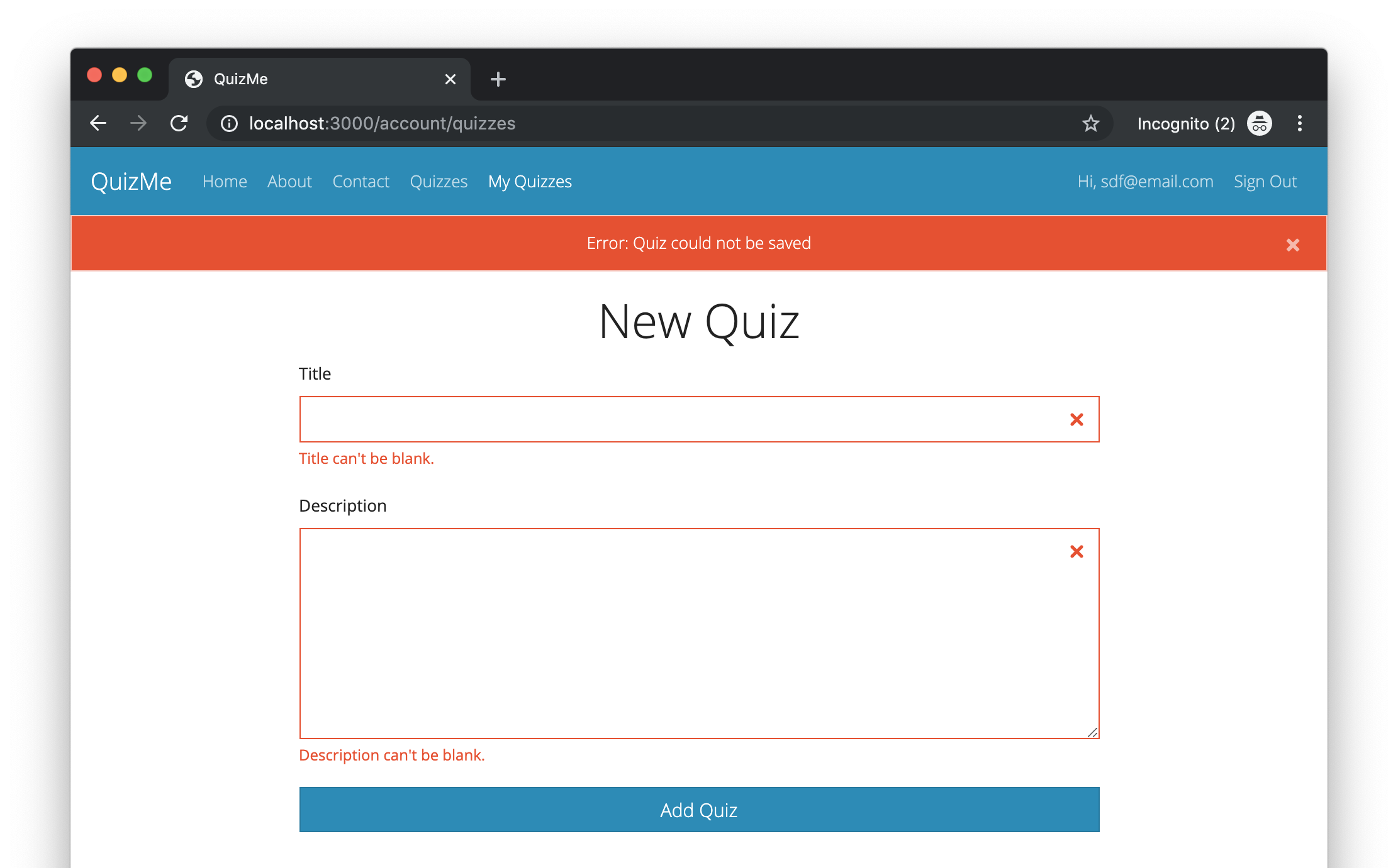
In particular, we will update the new form for Quiz records such that the form will now annotate form fields with error messages, as depicted in Figure 1.

Figure 1. Updated form page for Quiz records that now annotates form fields with error messages.
Making this change will involve two main tasks:
- We will use the Bootstrap form classes to improve the look of the app’s form fields.
- We will add attribute-specific error messages and coloring to the form fields to make it clearer to the user what errors they need to fix in their input.
1. Styling the new Form for Quiz Records with Bootstrap Form Classes
Styling forms using the Bootstrap form classes can be accomplished as follows. Each div that contains a label and a field element should have the form-group class. Each field element should have the form-control class. The submit button should have the btn class, and probably one or more of the special button-styling classes, such as btn-primary for color or btn-block for a full-width button.
Add the appropriate Bootstrap form classes to the account_quizzes/new.html.erb view, like this:
<div class="form-group">
  <%= form.label :title %>
  <%= form.text_field :title, class: "form-control" %>
</div>

<div class="form-group">
  <%= form.label :description %>
  <%= form.text_area :description, size: "27x7", class: "form-control" %>
</div>

<%= form.submit "Add Quiz", class: "btn btn-block btn-primary" %>
Notice that we no longer need the br elements between the labels and fields.
Verify that the above code works correctly by running the app and opening the URL http://localhost:3000/account_quizzes/new in the browser. The new, improved style of the form fields should now be apparent.
2. Annotating the new Form for Quiz Records with Field-Specific Error Messages
When a Rails model validation fails, Rails adds a description of the error to an errors hash that is part of the model object. We can determine if an object is invalid (i.e., has any validation errors) by checking if the errors hash is empty. We can also retrieve the error messages for a particular attribute using a key-based lookup in the errors hash.
Before each div with CSS class form-group, add a boolean variable that holds whether there are errors for the corresponding attribute, like this code for the title attribute:
<% invalid = quiz.errors.include?(:title) %>
Use the invalid variable to conditionally add the is-invalid class to the field element if there are any errors for the attribute, like this code for the title attribute:
<%= form.text_field :title, class: "form-control #{'is-invalid' if invalid}" %>
Display the error messages for the attribute (if there are any) by conditionally inserting a div with the error message after the field element, like this code for the title attribute:
<% if invalid %>
  <div class="invalid-feedback d-block">
    <% quiz.errors.full_messages_for(:title).each do |error_message| %>
      <%= error_message %>.
    <% end %>
  </div>
<% end %>
The preceding steps should be followed for each form field such that, in the end, each one looks similar to the title field:
<% invalid = quiz.errors.include?(:title) %>
<div class="form-group">
  <%= form.label :title %>
  <%= form.text_field :title, class: "form-control #{'is-invalid' if invalid}" %>
  <% if invalid %>
    <div class="invalid-feedback d-block">
      <% quiz.errors.full_messages_for(:title).each do |error_message| %>
        <%= error_message %>.
      <% end %>
    </div>
  <% end %>
</div>
Verify that the above code works correctly by running the app, opening the URL http://localhost:3000/account_quizzes/new in the browser, and submitting the form with invalid data. The new field-specific error messages should be displayed after each failed submission of the form.